
Before I start rambling about how I made my new logo, yes, idiots.exe episode 2 is still on the way. There is still no confirmed release date for it. Keep hanging tight for that.
For those of you that didn't click away immediately after reading that, I'm gonna assume you're interested. Read on! Why even change the logo?
There are a few reasons.
One is that the logo depicts the old capitalization format of my username: ROBOTunderscore. Due to an overwhelming amount of people reading the name as "robo tunder score," I changed the capitalization format to RobotUnderscore, but it's still present in my logo. The other reason is that it's not a vector file. The logo itself is a 3D object which I render to a png file, which is extremely unprofessional, since you're supposed to use a vector file type like svg, so you can use it in any size. However, above all, I just find that this logo is going to get outdated very fast. It definitely does something different, but I feel like in a few years' time, it's just going to look ugly. I want a logo that is simple enough to withstand the test of time. Where do you start?
You start with fonts.
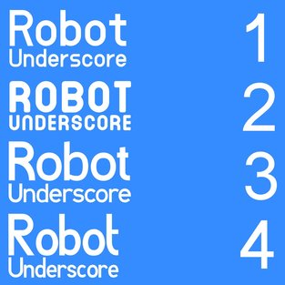
So I went on dafont.com and scrolled through over 1000 free-for-any-purpose fonts and picked 3 that I liked. I tried to stay away from Helvetica-like fonts as much as possible, because while it is a great font, it's been used to death, and that's not going to make for a logo that will last. I needed a font that didn't really follow any graphic design trend. The fonts I picked were DustHome (1), DINASTI (2), and I shot the serif (3). I also left the door open for the font of my old logo, Agoestoesan (4), as a possible option. At first I had second thoughts about downloading DINASTI since it was an all-caps font, but I went with it anyway, and I'm glad I did. I posted the image above on Twitter, asking which font would be the best for a new logo. DINASTI won in a landslide.
Don't get me wrong, DustHome and I shot the serif are good fonts. Agoestoesan is an interesting font too. But DINASTI was the best for the fact that it stands out. It's not a Helvetica-like cop-out and it doesn't try too hard to be different to the point of ugliness.
DINASTI just works. Now what?

Now that there's a font to work with, there just needs to be a creative way to display that font.
Fortunately, for the old logo, it is not a completely lost cause. I may not want to keep the thing itself, but I did want to reuse its format. It has the word "ROBOT" resting on top of a bar that says "underscore." My username, RobotUnderscore, actually means nothing, and it's just a nonsense handle that I chose. (I originally wanted "Robot_", but that name was taken on Twitter, so I just spelled it out.) Since there is no meaning in the name, there are few things that can be done with the logo. However, we can take advantage of the word "underscore." Since an underscore is basically an underline in symbol form, we can use that word as a literal underscore in the logo. 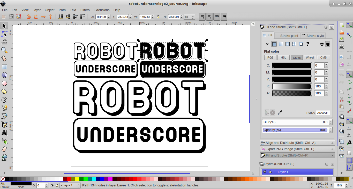
Nope! I used Inkscape.
Inkscape is a free and open-source vector design program that I had been meaning to learn to use for a while now, and this new logo seemed like the perfect chance, since I wanted it in SVG format. (I also wanted to make the top bar of the letter T in DINASTI wider because I find it too narrow.) With enough experimenting (and frustrated Google searches,) I eventually fixed the letter T and finished the logo. (Compare the T in the screenshot above to the T in the previous screenshots of DINASTI.) I used a rounded rectangle for the underscore since all the letters in DINASTI have rounded corners. I then made the ROBOT text and underscore white with a 15 pt. black outline, and made the UNDERSCORE text a plain black. From there, I took what I had so far, duplicated it, and made it a silhouette to put behind the white logo part, giving the logo its drop shadow. I originally wanted to made the shadow part a 3D extrusion of the entire logo, but I couldn't get that to work, so I settled for the simple shadow. 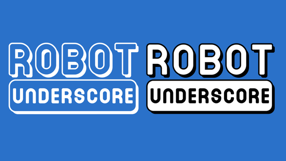
And that's all there is to it!
While I'm a big fan of using only monochrome versions of logos for aesthetic reasons, what's interesting about this logo is that in some cases, like in the image above, is that the two-color version with both black and white (right-hand side) works better than the monochrome version (left-hand side). I'm probably going to stick with the monochrome version for the most part, though. So that's it! I hope you enjoyed reading my thoughts, especially if you're a graphic designer yourself. 
0 Comments
Leave a Reply. |

 RSS Feed
